Sunday, March 25, 2012

Step by Step Watercolor Process for "Lady in Red"

This piece was completed during my time as the Artist in Residence at the Museum of the Southwest Children's Museum.  It sold while I was still there!  I love the little dog and the metallic teapot in this painting.

First Step:  The sketch.  This is where I lay out my composition and make sure my rendering is the way I want it.  I transfer my rough drawing to Arches watercolor paper and stretch the paper on gator board.
2.  I start with the first washes of color in the layering process.
3.  More layers and depth are added to the face and the dog as well as more work to outer objects.
4. More detail added to the two main figures, shading on her dress collar.
5.  The dark areas are added to the lady's hair and the dog.  I start building the orchid and the red dress.
6.  I start adding the darkest colors last and I am waiting to start the teapot since the reflection is painted from life as if it is really sitting on the painting.
7.  The dark back ground and sleeve are added last to prevent the dominant color from bleeding into another.  The teapot's shiny surface is not created with 'silver' paint but with attention to the colors reflected in its surface.

I appreciate comments and questions!  Please check out my website for more information about the symbols in this piece!

To buy this print:


Sizes

Thursday, March 22, 2012

Fruit of the Spirit- Goodness

This piece is from my "Fruit of the Spirit" series.  This series is one of my favorites for several reasons. 
1. I love the subject matter- the wonderful characteristics that come from a relationship with Jesus!
2. Portraying this list as something other than literally fruit.  I was so frustrated with the boring imagery associated with the Fruit of the Spirit seen in "Christian" art and in bookstores.
3. The beautiful women from around the globe representing each characteristic.

I chose to use women because that's kind of what I do and it relates to the tradition in art of women representing the seven virtues.  I thought this was the logical unfolding of this line of thought.

In this series I am using a loose Art Nouveau style.  This is characterized by some stylization, sectioning of different areas, and a feel of advertising.  I like the use of advertising styles in my series work because it lends another layer of meaning to my work.  To me, it is a positive use of 'propaganda' the institutional church has used for centuries.  That's all I am going to say about that...

"Goodness'" look is a loose representation of the color and beauty of Latin American culture.  I was thinking of Frida Kahlo when I designed her.  This is also the first painting I did for the series.  I started the greyhound theme here as well.  Greyhounds are not in every fruit, but in the majority.  They represent faith and the more I researched each characteristic, the more faith seemed important to each.

To read a more in depth account of the symbolism of this piece click here!
To order prints of this series, click here!

I appreciate any comments you may have! 

Thursday, March 8, 2012

Slightly Bi-polar art

I just finished two pieces of art in the last week.  They are very different from each other to say the least.  One is a symbolic commentary on our youth, religion and the times we live in and the other is light and frothy. 
See if you can tell which is which...

"Untitled Saint"-watercolor


"Musings II"-watercolor and ink
Please pass this along and check out my website for prints and other stuff!

Thursday, March 1, 2012

Award winning Painting Step by Step

 This image was chosen for the show poster at Celebration of the Arts in 2012!  This piece also won an award at a National Juried Show.

Here is the step by step of the painting in progress:

This the sketch for the painting. I always work out my design and layout with a pencil sketch and then transfer it to good watercolor paper.  Watercolor is pretty unforgiving compared with oil and acrylic.  I will not be able to paint over areas if I make a mistake...

Here I have started my first layers on the face, sunflower and strawberries.  I start a Caucasian skin color with yellow ochre.  The base layer may not indicate the main finished color, but since I use a layering process, the color adds richness to the final image.


 I have started building the framework for the face with burnt sienna and the leaves on the sunflower are based in a bright yellow.  I have started details in the wimple and the strawberries get another layer.

More detail in the face with her eye color and lips as well as more structure shading using a burnt umber.  The strawberries are getting their shading and I have started the lime green teapot.
The sunflower is getting more depth with yellow ochre and the stem and leaves layers are started.

I work on areas around the piece to let places dry in between painted layers so the colors come up through each other instead of mixing and bleeding.  I work light to dark to avoid bleeding in colors as well.

I have almost completed the detail in the face with a layer of sepia in the darkest areas.  I very rarely use black.  It is not on my palette at all!
Her wimple is getting more depth with burnt umber and Prussian blue and I am adding shading to the lime green part of the teapot.

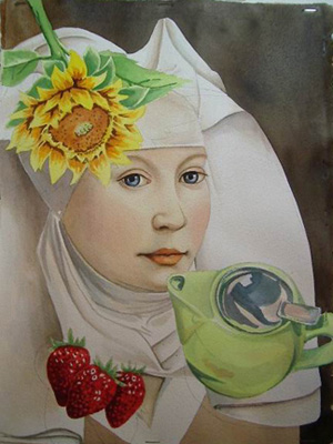
I am building the final shadows along the face and wimple as well as the sunflower and teapot.  The face is my interpretation of a master painting from a book, but the added objects are actually sitting on the painting or table and painted from life.
The metal top to the tea pot is starting to get some depth.  Painting metal is not about using silver or gold paint, but capturing the light and shapes of color in the reflections.  I don't think of 'silver' when I am painting silver metal, I think of the different shapes creating the overall object.

I have added the background sepia color to make the portrait pop.  I add dark backgrounds only when I am done painting the shapes that directly touch that area to prevent any bleeding.

To finish the piece, I add the shadows around the still life objects last since they over paint areas.  I also add in her blue dress and finish the reflection for the teapot.

The symbolism in this piece is about being a vessel of righteousness and power.  To read the full meaning:http://www.artbysaradb.com/html/sunflower.html

If you found this interesting, please forward it to a friend and join my email list!

To buy this painting "Sunflower" 11x14 watercolor on paper: $500 plus $20 shipping unframed
To purchase signed reproductions of this piece:

Sizes