Hi!!
My blog has moved! Please continue to follow me, here: http://artbysaradb.wordpress.com/
Thank you!! Have a wonderful day!
Sara

Thoughts about the art world, Sara's own work and being an artist.
Wednesday, December 5, 2012
Monday, June 18, 2012
Time Lapse Painting-"The Call"
This is the painting I was working on at Celebration of the Arts in May! I finished it a couple of weeks ago and compiled the photos I took as I painted it! I hope you enjoy!
I really love mixing up imagery from different cultures and time periods. In this piece, I have a Caucasian woman wearing traditional Japanese makeup and a kimono. To me, this represents how the Body of Christ is made up of many different parts. Each part is important and each part has its own destiny working together. The sheep represent Christ as our Shepherd and the rainbow signifies the beneficial promises of God. She holds the red phone up as if to hand it to the viewer to receive the call. The Spirit calls each of us to a specific destiny that we were born and designed to do. However, we must listen to the Spirit’s leading to reach His perfect will for us.
Thank you for any comments and for passing this along! Please also check out my website for more information about this painting and others!!
Sunday, June 10, 2012
Time Lapse Painting- The Saint and the Sock Monkey
I have been playing with some video software and I was able to compile the work in progress images into a time lapse video!! I am sure they will get better as I practice, but this will give you an idea!
Thank you for your support or my work. Please visit my website for more information and art!
Friday, June 8, 2012
Lubbock Showing
I am so fortunate to have the opportunity to show my art in Lubbock, TX! I hung 10 pieces at the "Good Brews" cafe last week. Thank you so much to Jill Snelson for helping me and for Nat Long for hanging the show! I hope my work blesses the people of Lubbock!
Thank you so much for your comments and for supporting my work!
Thank you so much for your comments and for supporting my work!
Tuesday, June 5, 2012
Art Show Virtual Tour
Celebration of the Arts was such a great show for me! I was the Distinguished Artist and I sold 5 pieces! The larger booth was such a treat and it was so fun interacting with people! I met some art lovers, artist and future artists!
For those of you who could not make it to the show, I have included a video of my booth and a video of me signing the show poster! Enjoy and I hope to see you at the next show!
Here is the booth!
Here I am signing a poster
Be sure to check out my website for more work!
For those of you who could not make it to the show, I have included a video of my booth and a video of me signing the show poster! Enjoy and I hope to see you at the next show!
Here is the booth!
Here I am signing a poster
Be sure to check out my website for more work!
Thursday, May 17, 2012
I am giving away art!
This is the piece I am donating to the silent auction for Friday night's Preview Party at Celebration of the Arts!
 It's a sweet little piece I finished this year. I found the inspiration for the folk art icon triptych in a children's book and added the peacock feather, symbolizing immortality, and the pear which symbolizes the incarnation of Christ. I thought they were appropriate symbols since the theme for the icon is the Christ as a child. I like the idea of the family icon as a focal point for the family's daily spiritual thoughts and prayers.
Someone's going to go home with this tomorrow night! It is matted, framed and 16x20.

Someone's going to go home with this tomorrow night! It is matted, framed and 16x20.
Monday, May 14, 2012
More sneak peeks!
Here is a little look into the piece I will be working on for COA this weekend! I will be painting live as I have time at the show!
 She's looking at little spooky so far. I am going for geisha makeup again...so she will look otherworldly for awhile!
 First layers of her hair. I am planning on making her a red head,but that has changed before... ;)
Don't forget to check out my website for more! http://www.artbysaradb.com


Don't forget to check out my website for more! http://www.artbysaradb.com
Sunday, May 13, 2012
Parents, please support your artistic children!
I am really blessed to have parents who recognized my artistic talent early on. Even if they didn't always understand my 'artistic' personality, they always supported my desire to further my art education. I had art lessons in third and fifth grade and when I finally decided on an art major, they didn't discourage me from that path!
My mom and dad were always quick to encourage my growth in art and never made me feel that I was wasting my time. Probably the biggest leap for them was when I quit my after college design job to paint full time. They were totally supportive! My mom still helps me out in my booth at art shows and is so proud.
I know I am fortunate from the stories from my fellow art students. One friend told me his parents thought he was gay based solely on his choice to be an art major. He's not gay, by the way, and is now happily married.
I imagine it is scary as a parent to have a child who wants to pursue an artistic field, especially as a career. I will be the first to tell anyone, that I am the exception. However, artistic people need a creative outlet to feel complete, whether it's music, art, literature, dance, or design. To be a career artist takes an organized personality, drive, and low overhead. Or, you are super lucky and get 'discovered.' An artist tends to be a bit sensitive, so encouragement is a must and permission to explore his or her field is important. So, even if an artist works as an accountant, waiter, doctor, teacher, or whatever during the week, knowing that the time spent pursuing their artistic passion is not a waste, is validating.
So, on this Mothers Day, 2012, thanks, Mom, for always supporting my love for creating. It changed my life.
Thursday, May 10, 2012
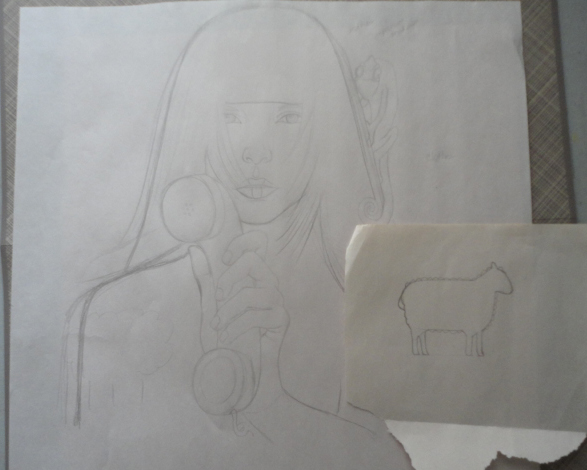
New Work in Progress!
Here is the sketch for one of my new paintings. I will probably be working on this live at Celebration of the Arts May 18-20.
This show the parts of the sketch before it's put together...
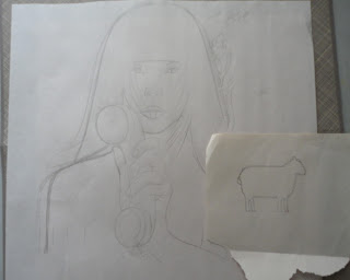 I use fancy tools like torn paper and pencils! After getting the basics done for the idea, I use a window or glass door in my house to transfer the sketch to good Arches watercolor paper. I have also measured and drawn this sketch to fit a frame I have waiting for it.
Here is the sketch on the watercolor paper. I draw really lightly so that my sketch won't be very visible when I watercolor it.
 Stay tuned to get a sneak peek of this piece before it's seen in public next weekend!
This show the parts of the sketch before it's put together...
Here is the sketch on the watercolor paper. I draw really lightly so that my sketch won't be very visible when I watercolor it.

Monday, April 30, 2012
More fun art!

I would love to get these licensed for Barnes and Noble book bags or skateboards or something fun! If you have any connections with any companies that would use this work, please let me know!
Thanks so much for any comments and don't forget to check out my website for more work and to purchase this piece, or reproductions of it!
Monday, April 23, 2012
Pretending to be a celebrity...
Well, today I got to pre-sign some of the show posters for Celebration of the Arts in May. I am the distinguished artist this year, so my painting, "Sunflower," is featured. I am so proud to be chosen, but it amuses me a little to sign the posters like I am a "pseudo-celebrity." Just enjoying the moment!
 For those of you who come to the show May 18-20, I will sign and personalize a poster just for you! So, please come out and see me!

Sunday, April 8, 2012
Fun at the Lubbock First Friday Art Trail
I just got back from spending time with a very good friend and a new friend at the Lubbock Art Trail. I went out to Lubbock to check out a space that I will be displaying in at the Good Brews Coffee Shop in June. That night was also the monthly Art Walk!
It's a fun way to get out and see some art. You start out at one of the gallery or art spaces on the route. You can ride the trolley for free to any of the spots and there are free beverages at many stops as well as beer and wine for sale! We at fresh pizza cooked in a brick oven by a vendor and it really hit the spot!
I really enjoyed the art and installations at the LHUCA center. There were some figurative and conceptual art as well as a potter and jeweler nearby. At the other stops there was art by the college students as well as some fabric crafters and more jewelry.
The weather was great and it was quite an adventure! I highly recommend the experience! It happens the first Friday of every month from 6:30-9pm!
As I am notoriously bad at snapping pics... I have no images to share. I will strive to do better next time!
Monday, April 2, 2012
Award!!
I won a second place award in a National Juried Art Show this week! I am so pumped!! So, now this piece is also an award winner!

Sunday, March 25, 2012
Step by Step Watercolor Process for "Lady in Red"

First Step: The sketch. This is where I lay out my composition and make sure my rendering is the way I want it. I transfer my rough drawing to Arches watercolor paper and stretch the paper on gator board.


I appreciate comments and questions! Please check out my website for more information about the symbols in this piece!
To buy this print:
Thursday, March 22, 2012
Fruit of the Spirit- Goodness

1. I love the subject matter- the wonderful characteristics that come from a relationship with Jesus!
2. Portraying this list as something other than literally fruit. I was so frustrated with the boring imagery associated with the Fruit of the Spirit seen in "Christian" art and in bookstores.
3. The beautiful women from around the globe representing each characteristic.
I chose to use women because that's kind of what I do and it relates to the tradition in art of women representing the seven virtues. I thought this was the logical unfolding of this line of thought.
In this series I am using a loose Art Nouveau style. This is characterized by some stylization, sectioning of different areas, and a feel of advertising. I like the use of advertising styles in my series work because it lends another layer of meaning to my work. To me, it is a positive use of 'propaganda' the institutional church has used for centuries. That's all I am going to say about that...
"Goodness'" look is a loose representation of the color and beauty of Latin American culture. I was thinking of Frida Kahlo when I designed her. This is also the first painting I did for the series. I started the greyhound theme here as well. Greyhounds are not in every fruit, but in the majority. They represent faith and the more I researched each characteristic, the more faith seemed important to each.
To read a more in depth account of the symbolism of this piece click here!
To order prints of this series, click here!
I appreciate any comments you may have!
Thursday, March 8, 2012
Slightly Bi-polar art
I just finished two pieces of art in the last week. They are very different from each other to say the least. One is a symbolic commentary on our youth, religion and the times we live in and the other is light and frothy.
See if you can tell which is which...
"Untitled Saint"-watercolor

"Musings II"-watercolor and ink
 Please pass this along and check out my website for prints and other stuff!
See if you can tell which is which...
"Untitled Saint"-watercolor

"Musings II"-watercolor and ink

Thursday, March 1, 2012
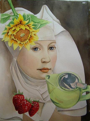
Award winning Painting Step by Step
Here is the step by step of the painting in progress:


I have started building the framework for the face with burnt sienna and the leaves on the sunflower are based in a bright yellow. I have started details in the wimple and the strawberries get another layer.

The sunflower is getting more depth with yellow ochre and the stem and leaves layers are started.
I work on areas around the piece to let places dry in between painted layers so the colors come up through each other instead of mixing and bleeding. I work light to dark to avoid bleeding in colors as well.

Her wimple is getting more depth with burnt umber and Prussian blue and I am adding shading to the lime green part of the teapot.

The metal top to the tea pot is starting to get some depth. Painting metal is not about using silver or gold paint, but capturing the light and shapes of color in the reflections. I don't think of 'silver' when I am painting silver metal, I think of the different shapes creating the overall object.


The symbolism in this piece is about being a vessel of righteousness and power. To read the full meaning:http://www.artbysaradb.com/html/sunflower.html
If you found this interesting, please forward it to a friend and join my email list!
To buy this painting "Sunflower" 11x14 watercolor on paper: $500 plus $20 shipping unframed
To purchase signed reproductions of this piece:
Monday, February 20, 2012
5 Ways I Get Ideas for Paintings
One question that I am asked frequently is: "How do you get your ideas?"
Well, I am always thinking about ideas for the next painting. So, ideas and inspiration can come from everywhere.
1. Since my work is religious in nature, my own spiritual life and study provides many ideas for me. I want to encourage my viewers with something positive or a new look at a familiar story or idea. Imagery from scripture lingers in my subconscious and I can draw from it.
2. Faces play a large part in my work, and I love people watching. I use people I know when I can, but it's even harder for me to part with a work done straight from someone I know. Much of the time, the faces are inspired by friends and family.
3. I love things that are quirky and unexpected. I like including seemingly random images to challenge my viewer to stop and wonder why in the world a praying mantis is perched on a young woman's head, for instance. I know this may perplex many people unfamiliar with contemporary ideas about art, but I am not being malicious, just whimsical!
4. Symbols fascinate me. I love reading stories and essays with metaphors and allegories. When I understand that there are multiple meanings for phrasing, characters, or images, I feel triumphant like I have solved a puzzle or see through a veil that not everyone can see through. It's that sense that I hope to give my viewers.
5. I piggy back ideas from previously finished works. When I finish a piece, I sometimes get the sense that there is more to say about the ideas I was exploring, or I see another way to express that same idea. On the other hand, some pieces are complete and I have no desire to explore anymore.
Please let me know any thoughts you may have on this subject and please tell a friend about my work!
http://www.artbysaradb.com
Thursday, February 16, 2012
Why I love Surrealism
"Surrealism is a cultural movement that began in the early 1920s, and is best known for the visual artworks and writings of the group members.
Surrealist works feature the element of surprise, unexpected juxtapositions and non -sequitur."-Wikipedia
There are many different aspects and facets of surrealism. Probably the most noted surrealist is Salvador Dali. He painted the famous 'melting clocks.'
I first learned about surrealism in ninth grade art. My teacher, Mrs. Quisenberry, gave us the assignment to create a surrealist drawing. I drew an underwater scene with finned zebras, elephants and giraffes swimming in sea weed. I loved the idea of drawing and painting fantastic ideas that couldn't appear in the 'real world.'
I think surrealism is different from fantasy art, but the two can overlap in places. In my own work, I have juxtaposed images and realities freely for the last 10 years. I used to be wary of the label of surrealism when collectors used it to describe my style. Now, I think it accurately describes my style and I am proud to be considered a surrealist.
In my most recent work, I use surrealism to convey something unexpected. Lately, combining unexpected pop culture references or insects or other 'misplaced' images with traditional or formal portraits is interesting to me.
Example:

In this piece, "Past Present Future," the formal portrait of a noble woman is juxtaposed with a cartoon unicorn and a kraken in the background. A little surreal...
To purchase a limited edition reproduction of this image:
To purchase the unframed original watercolor "Past Present Future"- 11x14- $500 plus $20 shipping
Thursday, February 9, 2012
Creative drug
I am starting to paint 3 new works after working on the sketches for 3 days this week. The feeling of accomplishment of having got the sketches done(and liking them), is like a drug, I think! I feel buoyed up and so pumped to see the finished painting! I get so impatient sometimes to see the end product, that I have to remind myself to take time to do an exceptional job worth showing the world.
 "Communication" 16x21 watercolor
Also, I am loving this painting from a few years ago. I go back and forth about even selling it. I am always drawn, no pun intended, to fish, so this piece is a fave of mine. I also love the 'hidden' blue tooth she is wearing. This theme of juxtaposing current technology and traditional portraits really appeals to me. I think the divide between the generations in our society is really a shame. If we didn't look down on those who have paved the roads for us, we may avoid the pitfalls they already tried to patch for us! Conversely, the lack of interest in current trends and technology by many older generations seems to speak of a unwillingness to be open to younger generation's ideas and thoughts.
I would love to hear your comments and please pass this along if you find this interesting.
Order limited edition reproductions of "Communication."
Please check out my website to see more of my work! www.artbysaradb.com
Sunday, February 5, 2012
5 Reasons Why YOUR Art Collection SHOULD NOT Match Your Couch
I don't have anything against great interior design, it's a hobby of mine. What drives me crazy is art buyers who won't support an artist they like and a piece of art that speaks to them because it doesn't "go" with their house. Bah!
1. Great art can hold it's own.
I grew up in a very conservative town by parents who didn't think much about art... until I came along. The first time I had seen art in a home that didn't match the couch was at a friend's house in Albuquerque when I was in college. He has a beautiful home with a wide range of original art hanging. It was amazing!! I noticed each piece and I could appreciate it's uniqueness. I certainly did not think that my friend couldn't coordinate his furniture!
2. "Matchy match" gets lost.
I will just say it. Matching art/prints blend into the to walls and decor, never to be seen again. If you hang a piece of art in a room with all of the same colors and patterns as the furnishings, the money you spent on something to see on your walls is wasted. I don't know how many times I walk into a home and barely glance at their boring art. Note: boring art does not mean traditional or representational.
3. A piece that speaks to you has earned its spot on the wall.
The art I have on my walls has the ability to stop me and make me pause to contemplate it almost daily. I notice the art on my walls and it speaks to me. I have a range of styles that I like and some are not 'wild' at all. However, they are pieces I truly love. Please hang art that will talk to you and refresh you or challenge you!
4. Something different makes YOU interesting.
A piece of art that speaks to you but may be a little out of your comfort zone says something interesting about you. Hanging it on your wall becomes a conversation piece and tells your visitors something about you that they may not know!
5. Supporting an artist and challenging art is good for the soul.
Artists really do appreciate kind words and encouragement, but when you take a piece of art home, you take little of the artist with you. It's a great compliment to the artist and that piece will likely become a 'friend' to you, a friend who reminds you of a good memory or challenges your way of thinking or shows you something new everyday.
So, the next time you are at an art festival, see a piece online or at a gallery and it speaks to you, please don't let the fact that it "doesn't match" keep you from getting the benefits of something beautiful and meaningful in your home.
Please check out my website to see more of my work! http://www.artbysaradb.com
and pass this along if you have enjoyed it!
Subscribe to:
Posts (Atom)